
Portland Pirates
Branding
As a die-hard hockey fan I love the timeless aesthetic of the classic hockey logo, whether it is the 8 spokes of the Bruins, the winged wheel of the Red Wings or the hidden H of the Hartford Whalers. Sadly a lot of the newer branding seems to have become generic and overbaked, lacking simplicity, confidence and the hockey spark.
In this passion project I wanted to re-establish my local team, the Portland Pirates as the classic hockey franchise they are. I wanted to give the organization and most importantly the fans a bold, brand refresh to rally behind. So the Pirates can re-establsh themselves as the iconic, historic Maine hockey franchise they are.

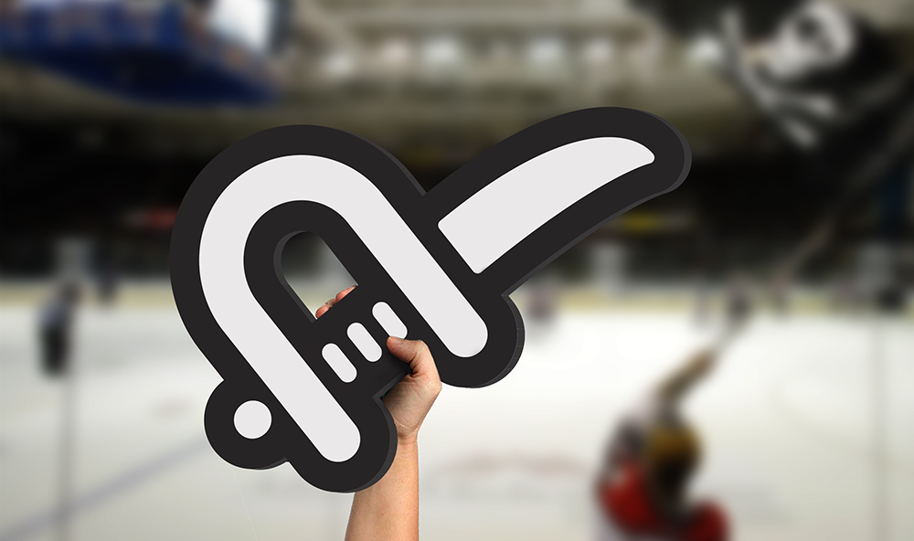
PORTLAND PIRATES - Full MArk

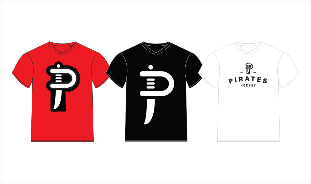
PORTLAND PIRATEs - JERSEY DESIGN
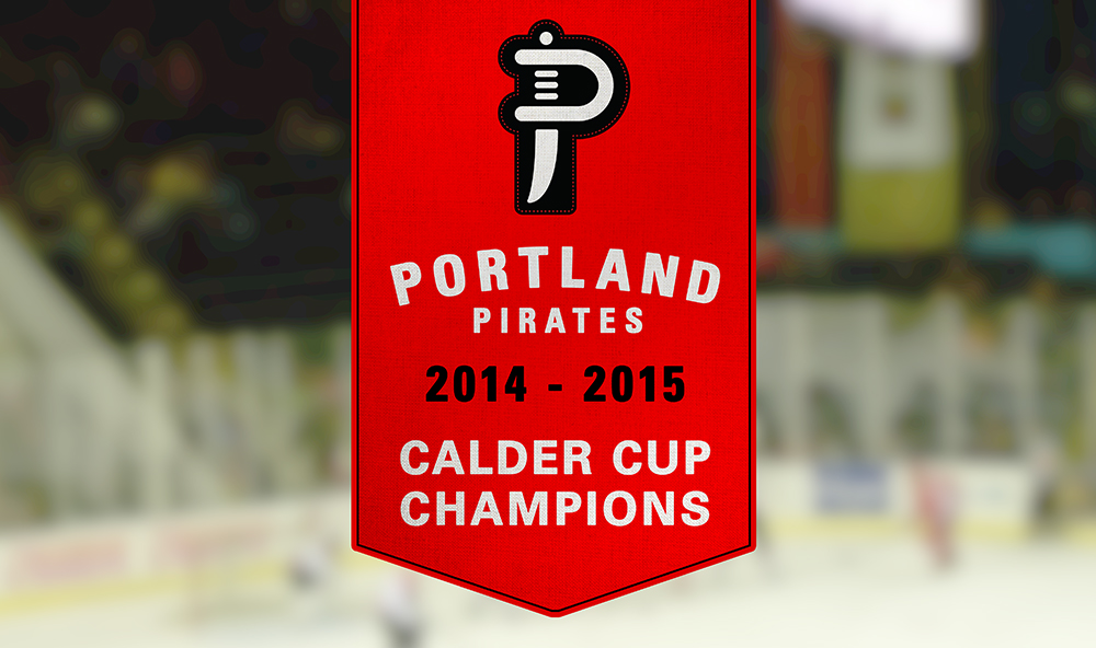
PORTLAND PIRATES - MERCHANDISE
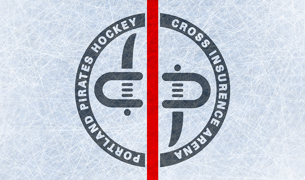

PORTLAND PIRATES - Brand Expansion
Northeast Mark Makers ©2017